Sunday, April 14, 2013

Wild! - Life

Welcome to another of my Illustration Friday blogs! This week the word is Wild! As I continue to illustrate annual report covers, I wondered which company was focused on the wild. Without much thought, the National Geographic came to mind. This company is known for its beautiful images and videos on wildlife. I thought to myself if they had an annual report it should have an awesome cover. Upon continuing my research, I found that they do indeed produce these reports. An example is showed below of the 2011 Report.


National Geographic AR Cover 2011

So it was now time for me to use my skills to express the word Wild. Here are a few ideas I had demonstrated through simple sketches called thumbnails.
TStewart_Thumbs Wild
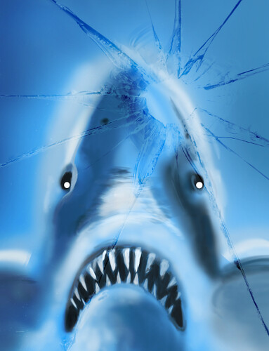
And we have a winner! What can be more wild than the killer whale (top left thumbnail).

Step 1
National Geographic is known for its yellow border. So I decided to start there to give myself a frame and colour scheme to work with.
WIP: National Geographic Wild

Step 2
I then added the background element, water that this killer whale would be coming through. This like all my Illustration Friday work is done in Photoshop CS5 using brushes.
WIP: National Geographic Wild

Step 3
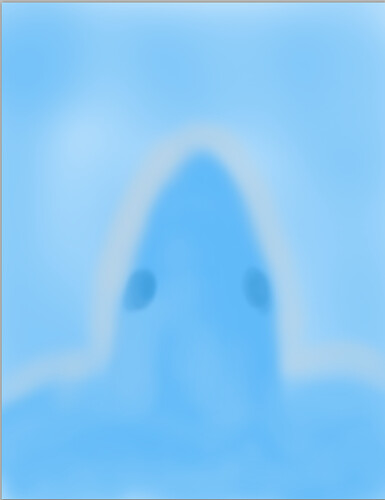
Blocking the area. In this step, I started to blocked the area for the whale, then added more water to see how the effect of water splashing would work.
WIP: National Geographic Wild

Step 4
I continued with blocking with black the shape of the whale. Although the shape seemed simple, it took a lot of care to obtain the shape I desired.
WIP: National Geographic Wild

Step 5
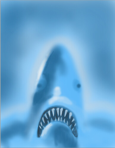
Adding Contrast. As you follow my blogpost. you would realize that the steps involved in painting in Photoshop may be the same. For this while it was a simple black and white and a few shades of grey contrasts.
WIP: National Geographic Wild

Step 6
The Splash effect. To complete the splash effect. more water was brushed in using a lower opacity. A special brush was chosen for this effect.
WIP: National Geographic Wild

The Final - WILD

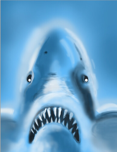
A making the image a smart layer, a filter was added to the illustration to create a water effect. The yellow border was redone. Text was added for the final touch.

National Geographic Wildlife Annual Report
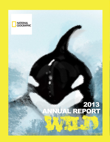
As I completed this illustration I thought, killer whale look a bit cute to be called killer whales. However, these mammals are indeed wild creates of the deep deep blue sea.

Monday, April 8, 2013

Free the Chicken and her Eggs!

Eat noting that has a mother, vegans say. In the western world today where people are becoming more health conscious fast food restaurants like Kentucky Fried Chicken is trying to offer vegetarians and vegan options. Of course, if chickens could talk, they would be happy! This is week I will illustrate another annual report cover on KFC using the Illustration Friday word of the week - Egg. French toast anyone?

I came across quite this funny image below that inspired me to keep this annual report cover fun. I thought it would be quite interesting if we freed the chicken and save their eggs!and as I vegetarian myself, and potential vegan I would support this cause.

Thou I walk - KFC

Here are a few thumbnails that I thought would represent the freedom of the egg and his mother. Some of these concepts were interesting, however I decided to chose the bottom center thumbnail to create this illustration.
TStewart_Thumbs egg

Step 1: Blocking. In this step, the background was filled in and the shape of the chicken flying through was painted in using a Photoshop CS5 brush. This step turn out pretty well and I was motivated to continue to see what my fling chicken would look like.
Step 1 WIP: Free the Chicken and her egg

Step 2:
Adding feathers and features. I played with several brushes here to find the right brush to demonstrate the feathers. I then settled on one and it seems to work quite well. This brush was a custom prest brush.
Step 2 WIP: Free the Chicken and her egg

Step 3:
Adding contrast usually brings your illustration to life. After covering the chicken with the lighter feathers, darker feathers and shadows brought this bird to life. I was very pleased with this stage. This may be named my favourite step in illustration. The details of the head and feet of the chicken was also illustrated.
Step 3 WIP: Free the Chicken and her egg

Step 4:
The Egg. In this step, I simple drew the impossible – a chicken flying away with her egg! This is why I love being an illustrator was you are allowed to imagine!
Step 4 WIP: Free the Chicken and her egg

Step 5:
Building were added to create the city feel. These buildings were painted in and embossed effected added.
Step 5 WIP: Free the Chicken and her egg

The Final:
Welcome to the New, Kentucy Fried Tofu Co. Ltd.
Kentucky Fried  Tofu

Chickens are now set free! No longer will they be slaughter and eaten. Their replacement is a soy based product called Tofu. Imagine if that were to really happen...if we all went vegan. What a happier world this would be – for the chicken and her eggs.

Sunday, March 31, 2013

Eye Glasses that Blinds!

Do you wear eyeglasses? What brand do you wear? Are you loyal to your brand? How well can you see with them? Did you know that most of the high-end brand name eye glasses on this planet is owned by one company? - Luxottica. Take off your glasses, open your eyes and take a look at my illustration for this week's word - 'eyeglasses'. I have been doing illustrations on Annual reports and what they could look like.

I wear Steve Madden, because I got the frame as a gift and based on my research it doesn't seem t be owned by Luxottica, so I am not promoting one of the world's monopolies. Here are the brands that the company owns.

Luxottica Household Brands
Luxottica Licensed Brands

Not only do they own these brands, they also own some of the retailers that sell the brands. Based on an article they could even be making 50 cent profit on every dollar you spend on a pair of shades. Some believe they are no better than the shades in a pharmacy and the money spent to update your shades and replace broken ones, is a fortune out of your pocket!

I created a few rough thumbnails to show a concept of Luxottica's customers blinded by its brands. The middle top thumbnail was chosen and the bottom left was incorporated into the design.
Thumbs eyeglasses
Below. are the steps used.

Step 1. Blocking the main area after creating the background. I only blocked the face to help myself get a feel of the shape head I wanted and the position. Unlike previous blogs, this time I used the lasso tool to get a more defined area

Step 1: Eyeglasses that Blinds

Step 2. Adding drawing lines. In this step I simple defined where he facial features are. They are not perfect right now but this was just to get a general idea. It is also time to note that this is my first portrait done in Photoshop and I intend keep improving as I love the look of portraits done in photoshop. I also added my reference image that I used to help with the face and hair.

Step 2: Eyeglasses that Blinds

Step 3: Eyeglasses that Blinds

Step 3. Painting! I was so excited when I was what kind of results photoshop painting can do. I blended colours for skin tone and added the glasses in, of course! The nose was the most challenging, but I believe it came out pretty well.

Step 5: Eyeglasses that Blinds

Step 4. Now, I added a radial gradient to make the glasses the focus of this illustration. Nice and simple step!

Step 6: Eyeglasses that Blinds

Step 5. The Most interesting step. How could i incorporate Luxottica's brands into this images. I wondered for a while where would I put the brand names. Then it came to me! on the glasses! So I visited Luxottica's website, took a screen shot of the brands charts and place it in photoshop on a layer in front of the glasses. I created a mask from the glasses then applied that mask to the brands screenshot. Quite unique looking.

Step 7: Eyeglasses that Blinds

The Finale. After lowering the opacity of the brands screen shot layer, I added my text and the Luxottica logo.

Do you see what I see? Is the brand you are wearing a Luxottica brand? If yes, I hope this opened your eyes so that so now know who really get your money.

Eye Glasses that Blinds

Monday, March 11, 2013

Swift Wings

If I had wings I would fly, I would fly, fly a way, fly-a-aay awayaaayy, and be-eee at rest. I am no singer but I do wish I had some wings. This week I will illustrate the word 'Wings'.

condorde wings

It was a lean mean swift machine. The Concorde commercial airplane does not seems to be around in 2014. Upon doing some research, I found out that, there was a crash in 2000, then this was followed by 911 in 2001l. Many people were afraid to fly in a regular airplane, much less the Concorde. On 24 October 2003, British Airways withdrew Concorde, bringing to a close the world’s only supersonic passenger service.

There was no other place on the Concorde that had the attention as did its Delta Wings. Let us remember the Concorde and its unique wings. This remembrance will be demonstrated through my illustration of an the annual report, entitled 'Remembering the Concorde'.

Here are a few thumbnails showing a 2014 Annual Report of the British Airways Concorde. Although I loved all my concepts, I decided to chose the thumbnail on the top right. It shows a unique angle of the airplane.

TStewart_Thumbjpeg

Using Photoshop for this project, my aim was to create a painting effect of the Concorde just after take off. My colour scheme incorporates a warm and cold colour as shown in my background. Let us take a look at how my illustration turned out!

Step 1: The Background

After painting a typical blue sky, I used a brush to create the organes bushes below. This would indicate the earth is still near and that the plan just took off.

Step 1: Background

Step 2: Blocking

Using references of what the Concorde would look like at my desired angle, I blocked out its shape using white. This was a quite rough estimate.

Step 2 Blocking

Step 3: Shaping things out Part 1.

Where are the wings? Where is the cockpit? I now started to drawn areas of the plane in that would make it look more like an airplane. I did this by adding contrast in shades of grey. Luckly the Concorde was a white plane and so all I needed was my grey scale.

Step 3 Defining the plane

Step 3: Shaping things out Part 2.

More contrast was added to the image. Things have started to come together, but not quite there yet. I proceeded on!

Step 4: Adding Details

Step 4: Adding a Photoshop Filter.

Now that I was satisfied with my contrast colouring, I decided to add a filter to my Concorde. Lesson learnt: Create Smart filters! everytime! My intension was to create a slight hazed effect, that you see when you look through window at the departing lounge, that caused my possibly fuel and heat. Instead the filters was overdone and I was not able to reverse it, having gotten too far. However, I thought the rough look was a bit unique and may be appreciated for what it is; art.

Step 5: The Plane

Step 5: Adding the Window.

This steps added a lot to the illustration, yet it was quite simple. By just turning your brush opacity down and selected your circular brush and turning hardness to 100%, I create four circles that gives the effect that you are look at the plane through a window with water droplets. I thought, this was quite nice.

Step 6: Adding Highlights

Step 6: The Final Illustration

Text was added to the illustration and overall it was no longer rough looking but neat. To highlight the wings the focus of the plane, I labeled it using red type.

Take your hats off and bow your heads and let's have a moment of silence, remembering the lean, mean delta wings machine; The Concorde.
Remembering the Concorde

Monday, January 21, 2013

The OCEAN fights back

We are tied to the ocean. And when we go back to the sea, whether it is to sail or to watch - we are going back from whence we came.
John F. Kennedy.

The first week's theme from Illustration Friday is 'Ocean'. In my quest to find a company which business was related to the ocean, I came across the 2011 annual report for, British Petroleum (BP). Yes! BP was the perfect company to display the word of the week and illustrate a new Annual Report cover.

Reflecting on 2010

BP Oil Spill 2010
Some would remember the greatest oil spill in history on Tuesday, April 20 2010; the  BP Oil Spill in the Gulf of Mexico. Many creatures died and people that depended on the Ocean were not able to earn and meet their daily wages.

Now let's imagine what if there were a Hostile takeover. As time has passed over the last two years, the fishes and wild life become stronger and fight back. The upcoming annual report could be entitled "The Ocean Fights Back".

Here are some ideas that I created. The top right, Jaws themed thumbnail was selected.

Thumbnails by Tashiya Stewart

Here is the various steps I used in Photoshop CS5 to illustrate 'The Ocean Fights Back'

Step 1: Blocking
In this step I simply painted the background and blocked out the shape of my Jaws.
Step 1: The Ocean Fights Back

Step 2: Contrast
The white teeth contrasts against the blue shark and ocean. It was a lot of fun painting in the sharp teeth; Jaws ready to attack!
Step 2: The Ocean Fights Back

Step 3: More Contrast, Detail and Layout
Jaws was resized to make him look larger and more dangerous.
Step 3: The Ocean Fights Back

Step 4: Broken Glass
The broken glass was placed in to create a feeling that Jaws is breaking through, coming to take revenge.
Step 4: The Ocean Fights Back

Step 5:Text & Logo
The BP Logo and theme of the Annual Report was added, formalizing the design.
Step 5: The Ocean Fights Back

The Final Design: Watercolour Filter and Increased Saturation to create more drama.
(Jaws sound track playing) Ta dum Tadum Tadum a dum adum adum.
The Ocean Fights Back
Corporate companies let's remember to take care of our ocean. When we go back to the ocean, we can be at peace with nature.

Welcome!


I recently decided to participate in Illustration friday (IF). Illustrationfriday.com is fantastic as it provides themed words each week where artists submit their illustration concepts of the word of the week. Last year, I participated in a project where I was responsible for the layout of 15 chapters for a best selling children's curriculum. I am unable to share more information about that project contents as I signed a non-disclosure agreement, but I can say that it led me to one of my passion in the design world, ie. effective layout of images and type on a page. As such, I will use this blog to  build a portfolio of annual report covers and a few inner pages showing some layout. Unlike my previous layout project, it is open to all to view and make comments!


You may ask, 'why annual reports?'. Well the answer is simple. . . 

  1. I am also business graduate who worked in the business world. I understand business documents but cared more about the looks of documents, than the content (and most documents were pretty dull looking).
  2. I hear annual report projects make a lot of money and making money is key to a freelance graphic artist. So maybe I will be able to contribute to the business world using the proper placement of images and type to make documents more appealing and reader-friendly while make a living a at the same time.